In the past, fading out an element in JavaScript involved literally looping thousands of times per second and gradually reducing the opacity of that element until it was set to zero. Once it was zero, you could pretty much get rid of it from the DOM using the Node.removeChild() method. But depending on the users browser or even CPU, you didn't always end up with consistent results.
Luckily there are better ways to do this now. In this post I will cover a few different approaches that you can take in order to smoothly fade out any element using just a few lines of CSS and JavaScript.
Using CSS transitions
One of the most common ways to fade out an element is to set up a CSS transition in which you reduce the opacity on a given time interval as mentioned above.
Take the following button for example:
Click me
With the following markup:
<a href='#' class='btn-fade' onclick='this.classList.add("fade")'>Click me</a>
The CSS to render the button, including the transition, is as follows:
.btn-fade{
    transition: 1s opacity, 1s visibility;
    opacity: 1;
    color: white;
    padding: 10px 20px;
    font-weight:bold;
}

.btn-fade:hover{
    background: mediumpurple;
    color:white;
}

.btn-fade.fade{
    opacity: 0;
    visibility: hidden;
}
A few things to notice. I set the transition value to target just the opacity and visibility properties. If you only target one of those properties, the browser will not render the fading effect.
Secondly, it's important to note that while the element will fade out, it won't actually be removed from the DOM in any way. It will still occupy the same space that it took before hand.
For most typical design scenarios, this will work just fine. Completely removing or collapsing an element will make the entire contents below that element shift upwards once it's gone and can lead to other issues with user experience.
Using CSS animations
A similar approach to CSS transitions is to create a custom CSS animation instead, in which you essentially do the same as with the transition. You shift the opacity from a 1 down to a 0 on a set interval.
You can read my 5-minute guide to CSS animations here.
Here is the same button using a CSS animation instead of a transition.
Click me
The effect is the same, though with a bit more work as we need to set up the animation @keyframes.
.post .btn-fade.fade{
    animation-duration: 1s;
    animation-name: fadeOut;
    animation-fill-mode: forwards;
}

@keyframes fadeOut
{
    from{
        opacity: 1;
    }

    to{
        opacity: 0;
        visibility: hidden;
    }
}
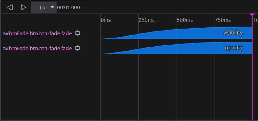
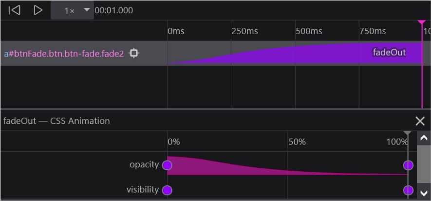
Regardless of which method you use here, both animations have an identical frame curve as can be seen here.
Using a transition

Using an animation

Because this is a relatively simple animation, there really isn't much difference in terms of performance. However, not all animations will be as easy. Some will require multiple property shifts which may incur some form of performance cost. So it's always good to use the Animation Inspector in your browser to test.
Using jQuery
And lastly, the quickest way to implement the fade out and fade in functionality, is to essentially allow another library to do it for you. jQuery is just that library.
<div id='box1'>Hello</div>
Fading out the <div> listed above comes down to the following:
$('#box1').fadeOut('fast');

$('#box1').fadeIn('fast');
And here's how that looks using jQuery:
Click me
Interestingly enough, the jQuery fade out method works a bit differently in that the library will add the display:none property to the element once it has completed the animation.
If you are looking to handle simple in and out animations, then jQuery might be a good choice at the cost of having to include another resource to your page.
If this is the only use of jQuery that you have however, it might be better to use either of the first 2 methods mentioned above.
Using JavaScript
And just for fun, here is a typical JavaScript only fade out function that would have been used in the past.
Click me
function customFadeOut(el){
    let myVar = setInterval(function(){
        el.style.opacity -= 1;

        if (el.style.opacity < 0){
            clearInterval(myVar);
            el.style.visibility = 'hidden';
        }
    }, 10);
}
And here is the animation timing sequence to compare with the previous methods.
It's pretty much an even and identical curve, which is expected.
As you can tell, even the slightest animation on a website requires some level of work and understanding of animation frames and timing sequences.
There is not right way to handle this because each use case can be so different. So choose the method that best works with your particular needs.